Brief: An assignment for a role at Tipico USA to make curated bets discoverable.
Process: Through comparative analysis and considering the entire team was just starting out with their North American platform, I chose to go a low-friction route that would engage the participant and also be technically feasible.
Result: I came on as Tipico's first North American UX/UI Designer
The following screens represent a flow that I feel adds the functionality needed to allow users to discover new bets while keeping the experience within the current design language.
Screen 1: For the exercise I wanted to explore the feature in more of a potential A/B scenario, where we could inject a CTA to prompt the user vs. finding a definitive home for it. Here it's represented on the main lobby.


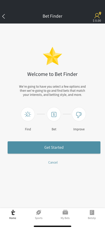
Screen 2: After tapping the call to action a user would be presented with this interstitial explaining the experience a little with an action to continue or cancel to return to the previous screen. The app title context changes as well.
Screen 3: Here's the business view of the experience. I enjoy the minimalism of the tools provided to narrow the results for a user to discover bets, already though it's more powerful than a large swath of other Sportsbooks that lack the feature completely.
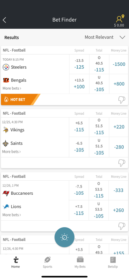
Screen 4a: After a user is satisfied with their criteria and submits, the view transitions. I imagine there's an opportunity for a transition animation between the submit button and now the hovering one at the bottom of the view. I also added a tool to sort the results by the options outlined in the req. Having the tool on this screen seemed appropriate vs including it on the previous view.
Also, for the results, you'll see I went with a card vs the current connected row view. This allows for separate visual priority and functionality like the "Hot Label" and "Dislike" Function.


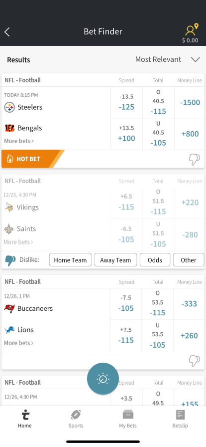
Screen 4b: On the Vikings @ Saints matchup is an example of the user defining that they dislike this matchup. I wanted to make the experience more of an opportunity to interact and get some real feedback data as well. So, for an NFL matchup, maybe the data points a user sees are the home team, away team, the odds, or other for their dislike reason. Also two things could come from this, in my opinion, a user will either not answer (deactivate the current state) or they will provide us with some decent data points for future bet finder sessions or for us to dynamically bubble up bets by these data points.
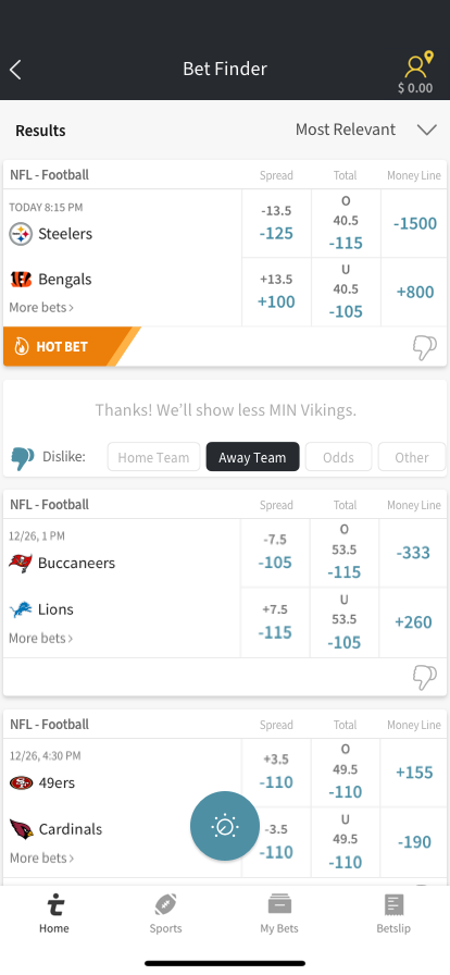
Screen 4c: After the user submits their feedback the card rolls up and has a bit of copy describing the transaction that happened. I think it's a great opportunity to provide more conversational dialog and give the tool a little personality based off the their reason.
